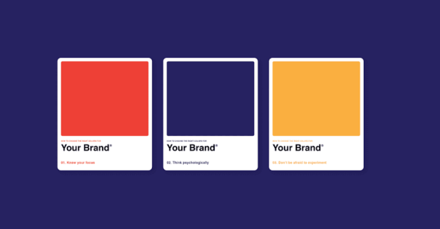
In branding, colour is more than just making things look pretty; it’s more about your brand standing out in the crowd. In this article, we will be going into a deep dive into colour psychology and why choosing the right colour can be a game changer.
Brand Identity

When choosing a brand identity, it’s important that you choose a brand colour you go with it. Does your brand have more of a serious, laid-back personality, or is it the ready-for-a-party type? Different colours convey different vibes, and understanding these personalities is key.
Should You Go for The Classic Red or Blue?

Red, blue, and sometimes yellow are the most commonly used colours when it comes to brand logos. Red screams passion and action, while blue has a more professional vibe that most brands go for. You’ll need to choose the one that suits your brand better.
Colour Psychology
Yes, certain colours make you want and crave different things, so most fast food joints have yellow and red in their logo to make you crave fries. You’ll need to delve into colour psychology and see how colours can play tricks in the mind of your target audience.
Choose the Right Palette
The right colour palette would make or break your brand design. So, pick a palette to fit your brand’s colours and match its personality.
All in all, branding isn’t just about pretty aesthetics. It’s more about influencing customers’ perceptions connecting emotionally with your audience while also standing out from the ever-saturated crowd.


No Comment! Be the first one.